City of Minneapolis Website redesign
The City of Minneapolis needed a new website that better served its residents and put accessibility first. To get there, myself and our project team spent 2 years created a human-centered strategy to focused on key tasks and designed a robust component library to support all the content teams at City Hall.
-
Product Design
Me
-
UX
Kiell Kosberg, Danielle Miller
-
Strategy
Chelsey Mona, Amber James
-
Development
Alex Barrett, Sean Hill
-
Client Strategist
Courtney Miner
In this project
01 Problem
A content free-for-all
Finding even the most basic information – like your neighborhood’s recycling day – was just about impossible on the City of Minneapolis’s website.
There were thousands of pages and no clear way they were organized. When content was published, there were no rules or guidelines on how to keep it up to date. We heard a particularly horrifying story about an out-of-date voter precinct map on the site that actually sent residents to the wrong polling place on election day.
Serving departments, not users
Each department within the city acted as their own content team and created pages according to their own priorities and internal organization – leading to duplicate content for each department, scavenger hunts (not the fun kind), and task dead-ends for users. And many, many micro sites. So many micro sites.
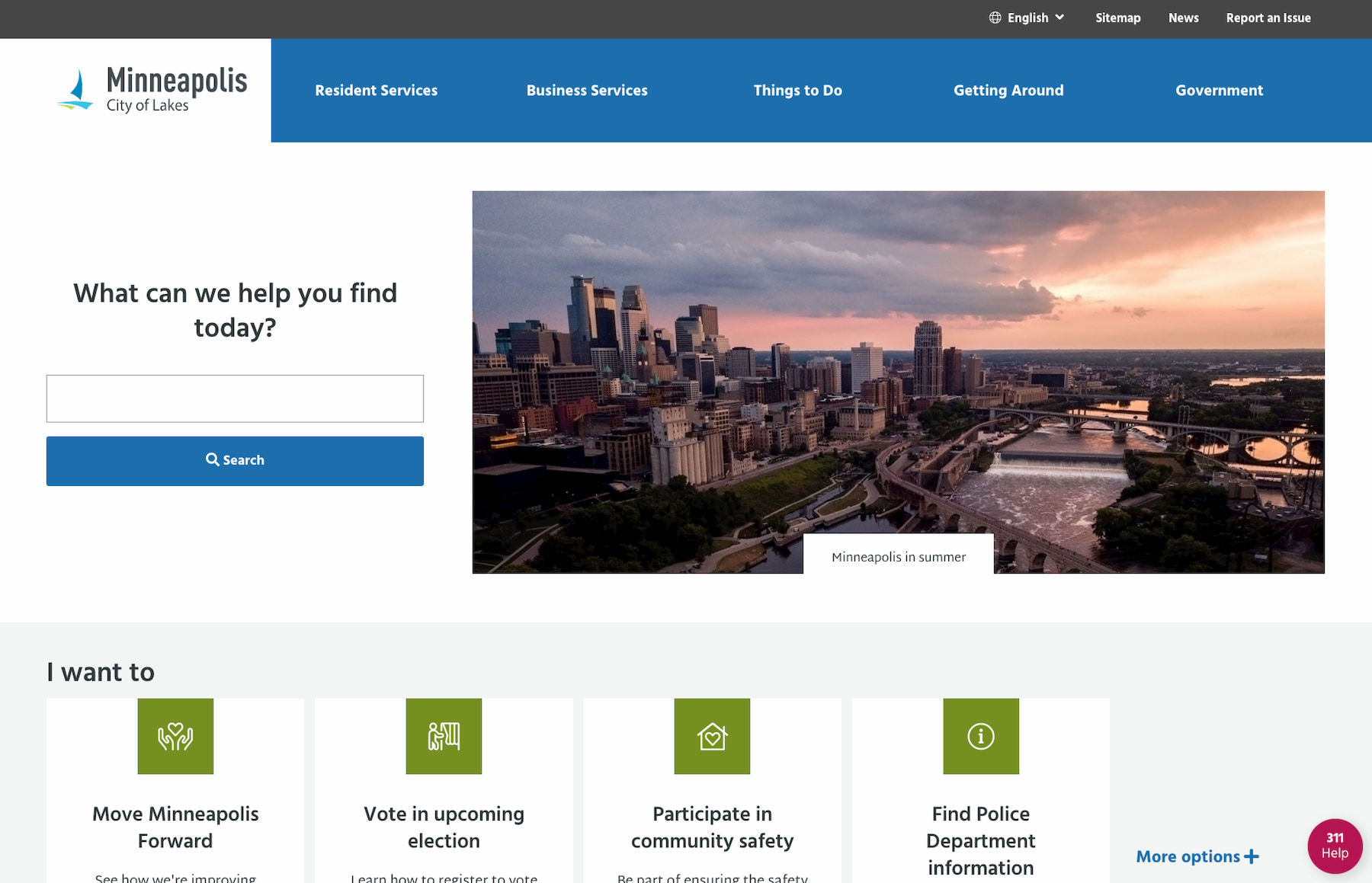
Old homepage
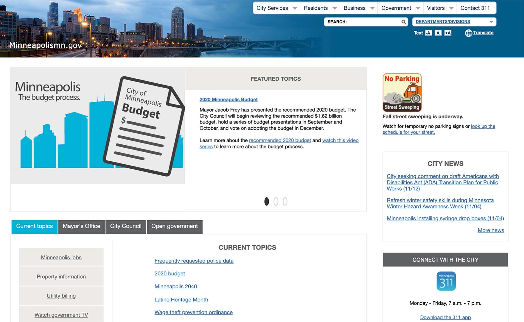
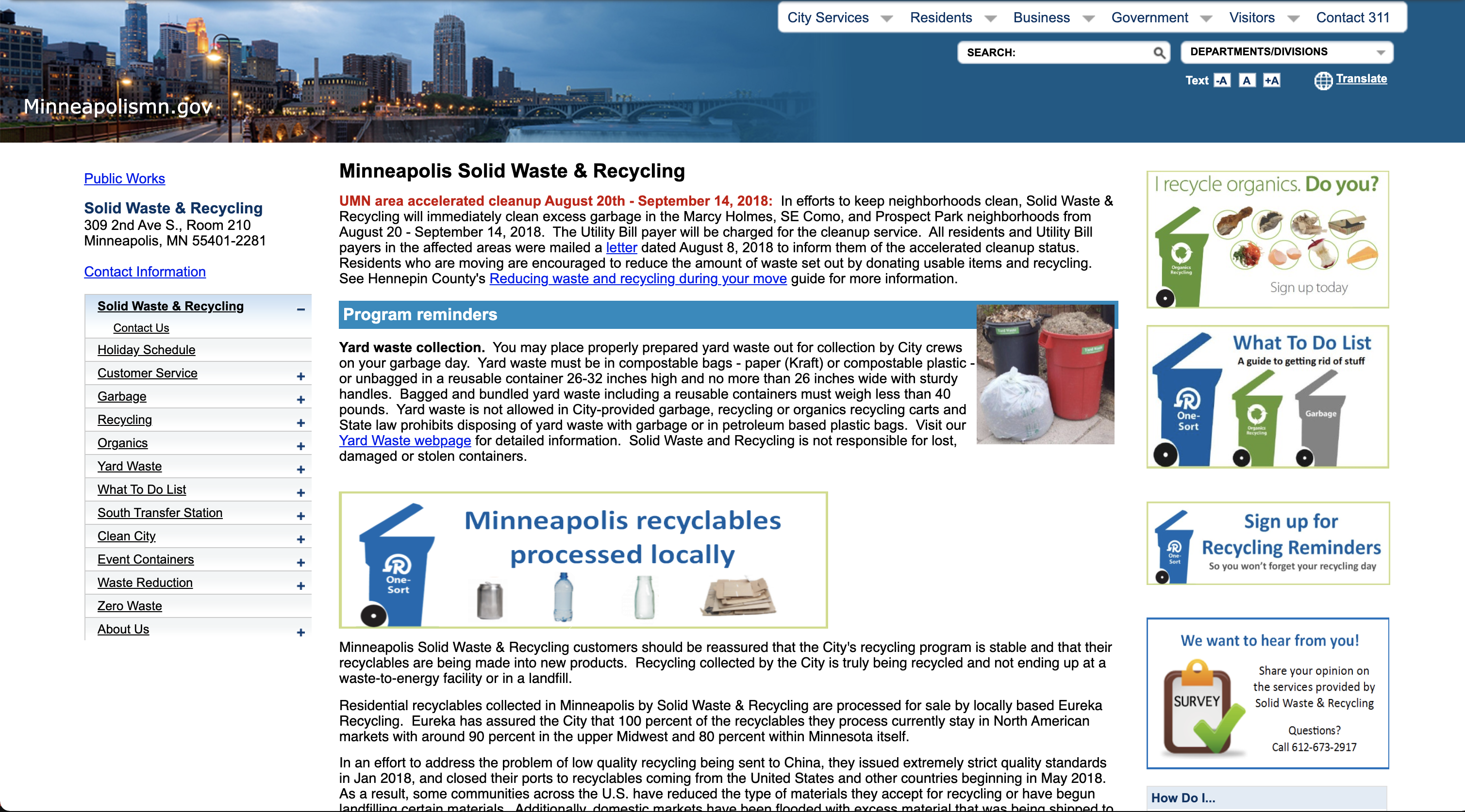
Old department page
Dated design
Content aside, the design of the website hadn’t been touched in years. On top of being very untrustworthy and not visually appealing, the dated design didn’t support mobile – which accounted for about 50% of their site visitors and growing.
And lastly, the design wasn’t accessible. This was in direct conflict with the City’s goals of being equitable and inclusive, not to mention a legal liability.
02 Research
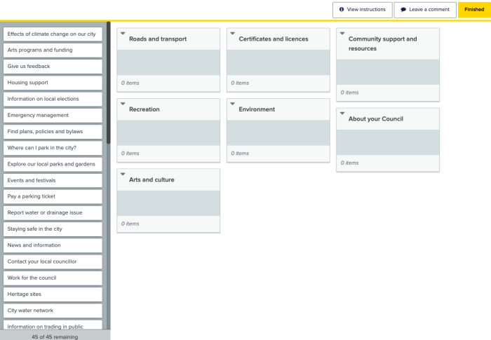
Card sorting
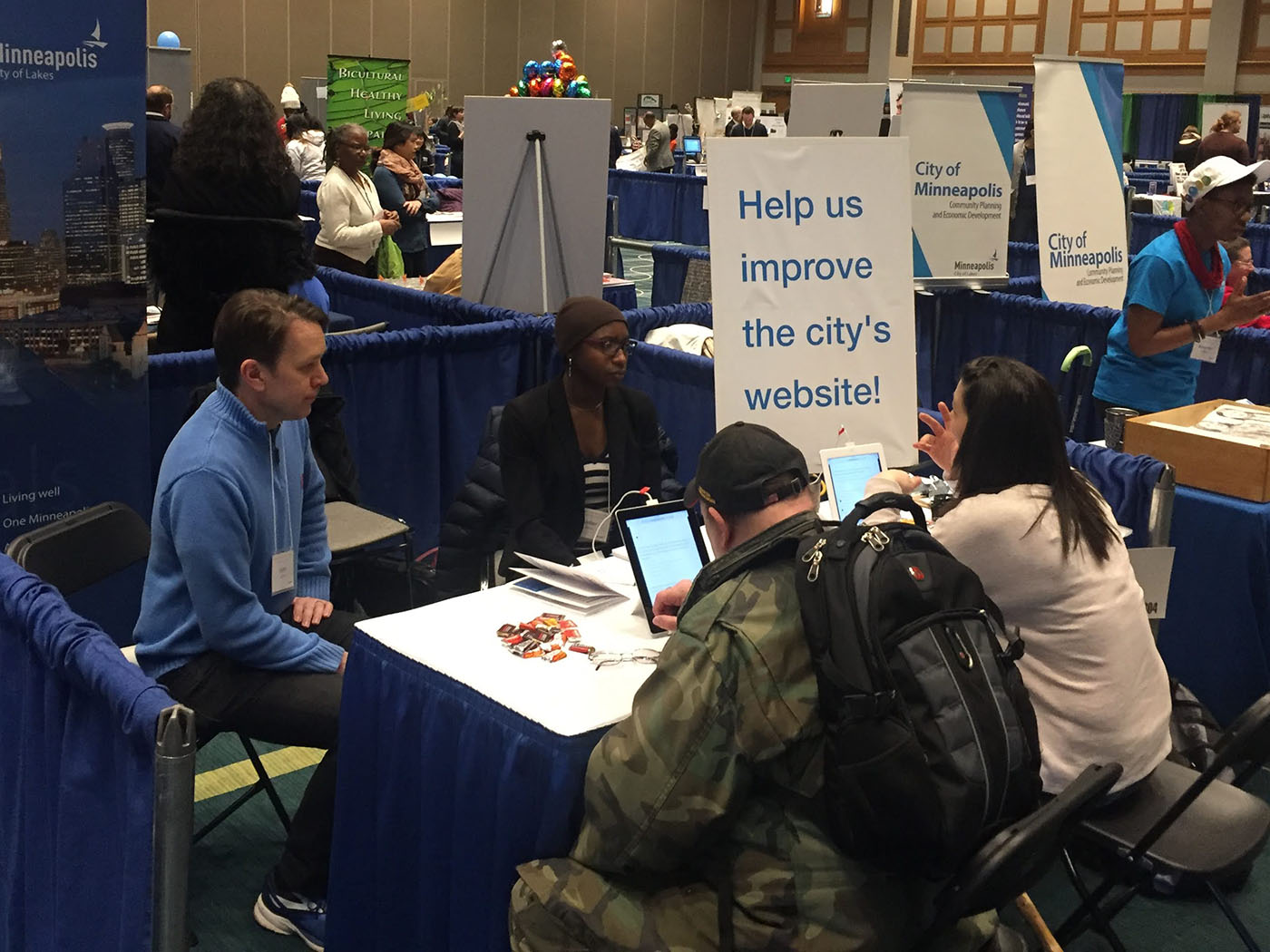
Talking to users
Asking users & stakeholders what they need
We set out asking users what they wanted to accomplish on the site, what content was most important to them, and how they would organize the massive amounts of pages the City needed to share. We conducted 1 on 1 interviews and sent out card sorting activities. We also paired this with stakeholder interviews of department heads and content admins to hear their goals.
Assessing the content
Lastly, we did an in-depth content audit and inventory to get a sense for what could stay and what could go – and how much content transformation was ahead of us.
03 Insights
Content team pain points
At the end of the day, these were the key pain points we needed to solve for:
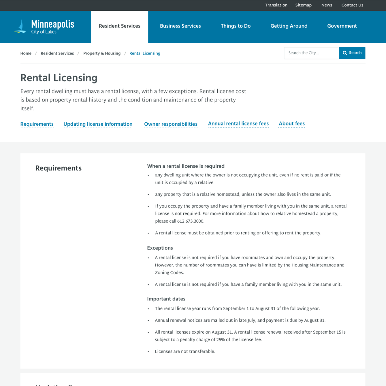
- Writing for the web
Content teams were often resorting to press-release style long-form content - Chunking up content into pages
Content teams were clearly struggling with how to make multi-page experiences with user friendly navigation and IA - Sharing, organizing, and elevating city projects and programs
This was causing low engagement, participation, and an inefficient publishing process - Elevating user needs over department priorities
Things like initiatives, press releases, and announcements were burying key tasks and updates that residents cared about most - Communicating key content through web pages instead of linked PDFs
Creating PDFs was always going to be easier than building a proper page or web form on the site
04 Strategy
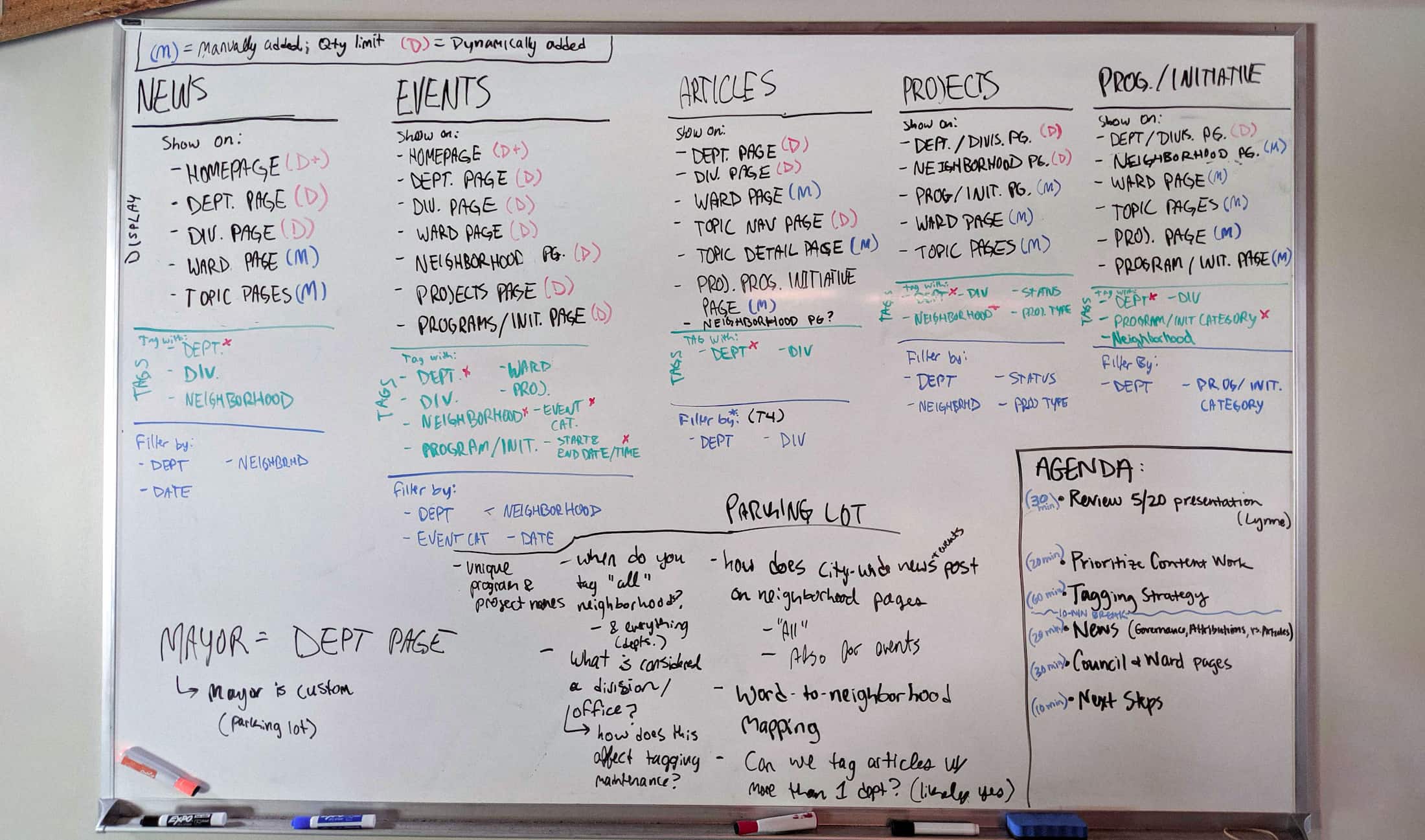
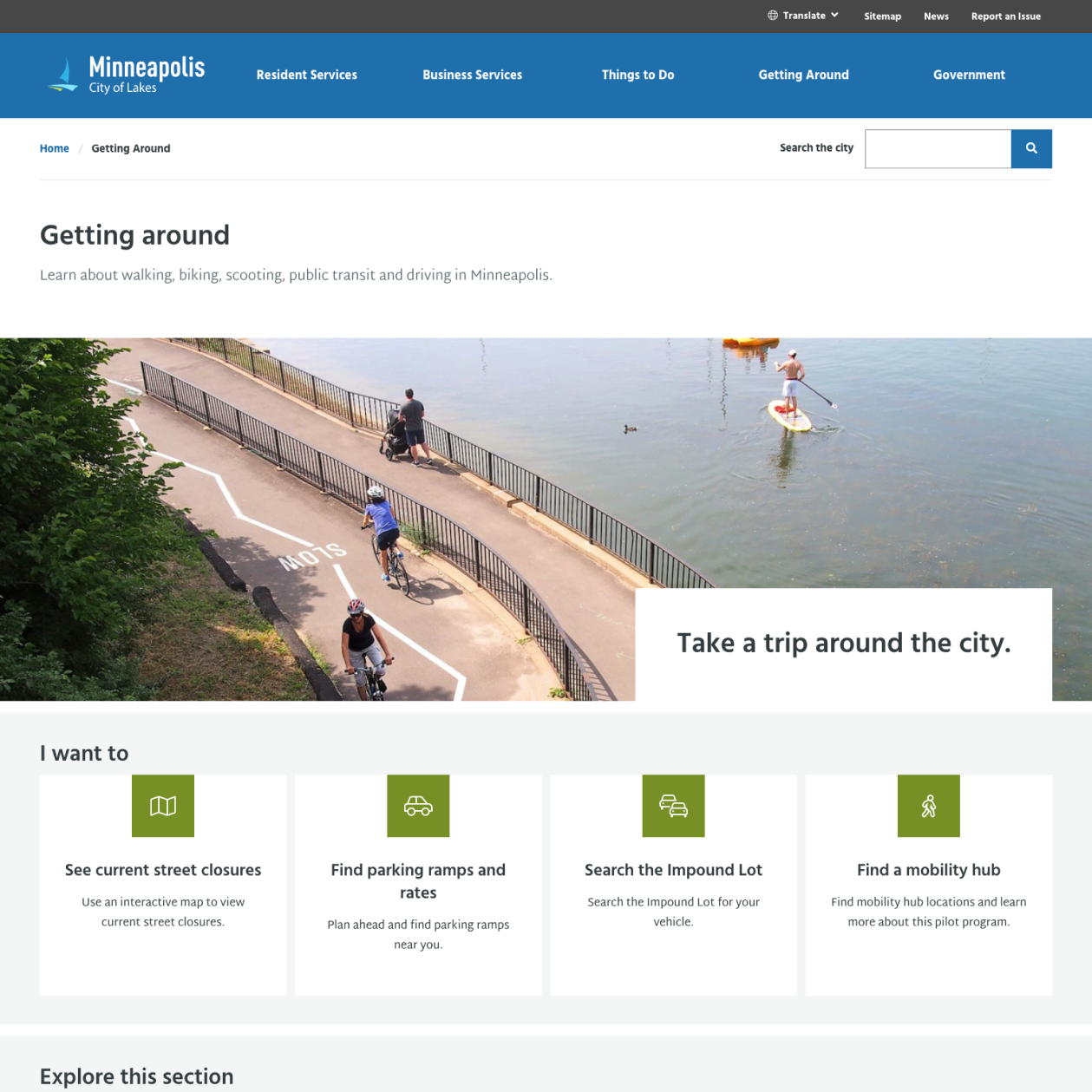
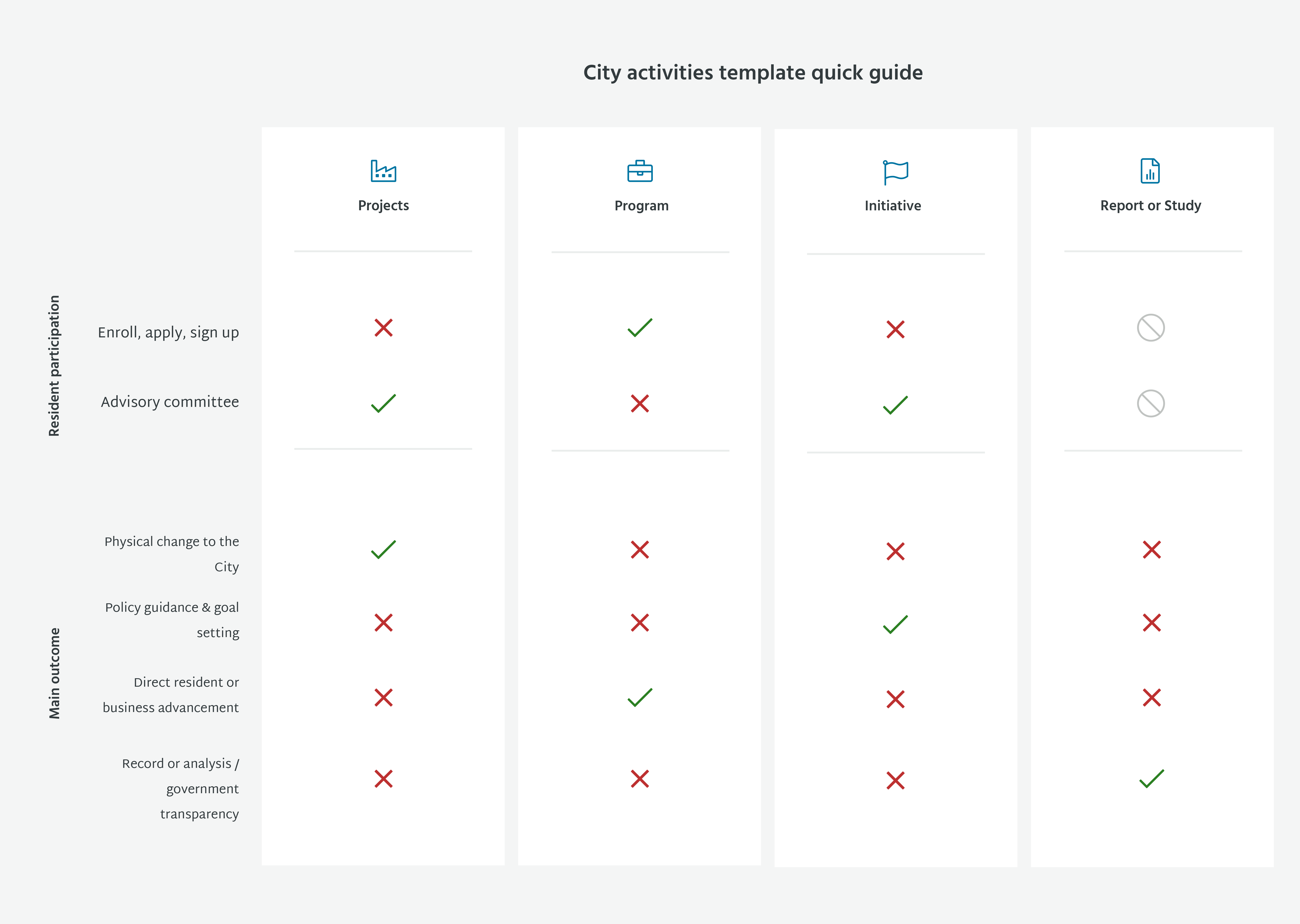
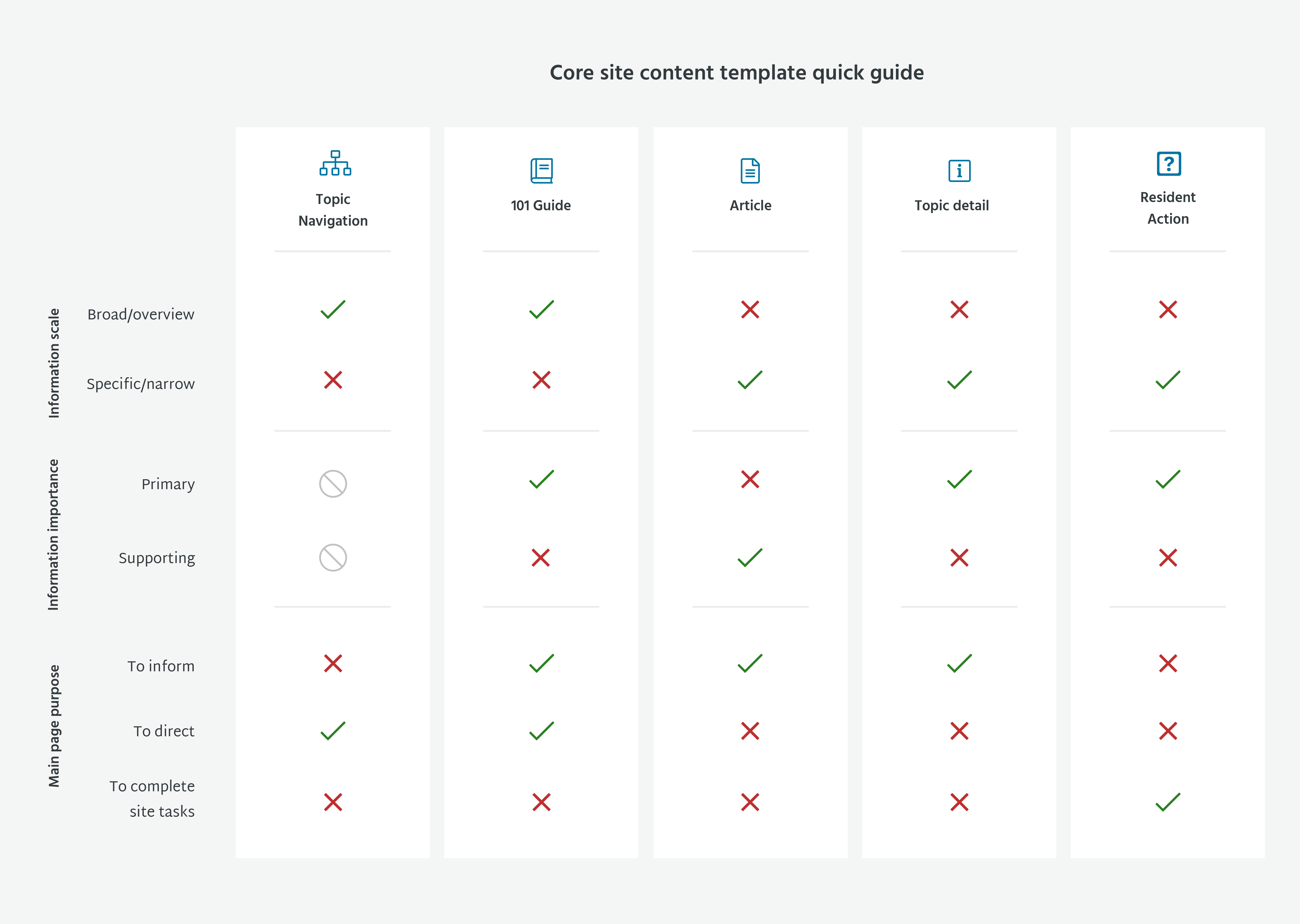
Templatized approach
I created a combined design system and content strategy that addressed key pain points through a collection of targeted templates.
Topic landing page
Topic detail page
Initiative
Project listing
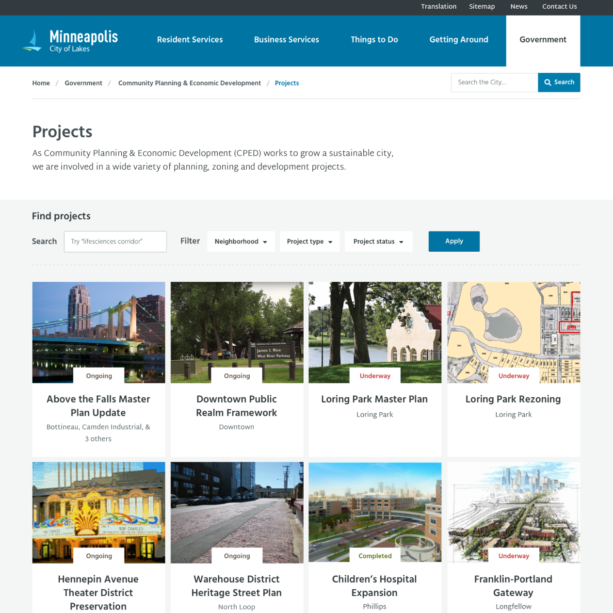
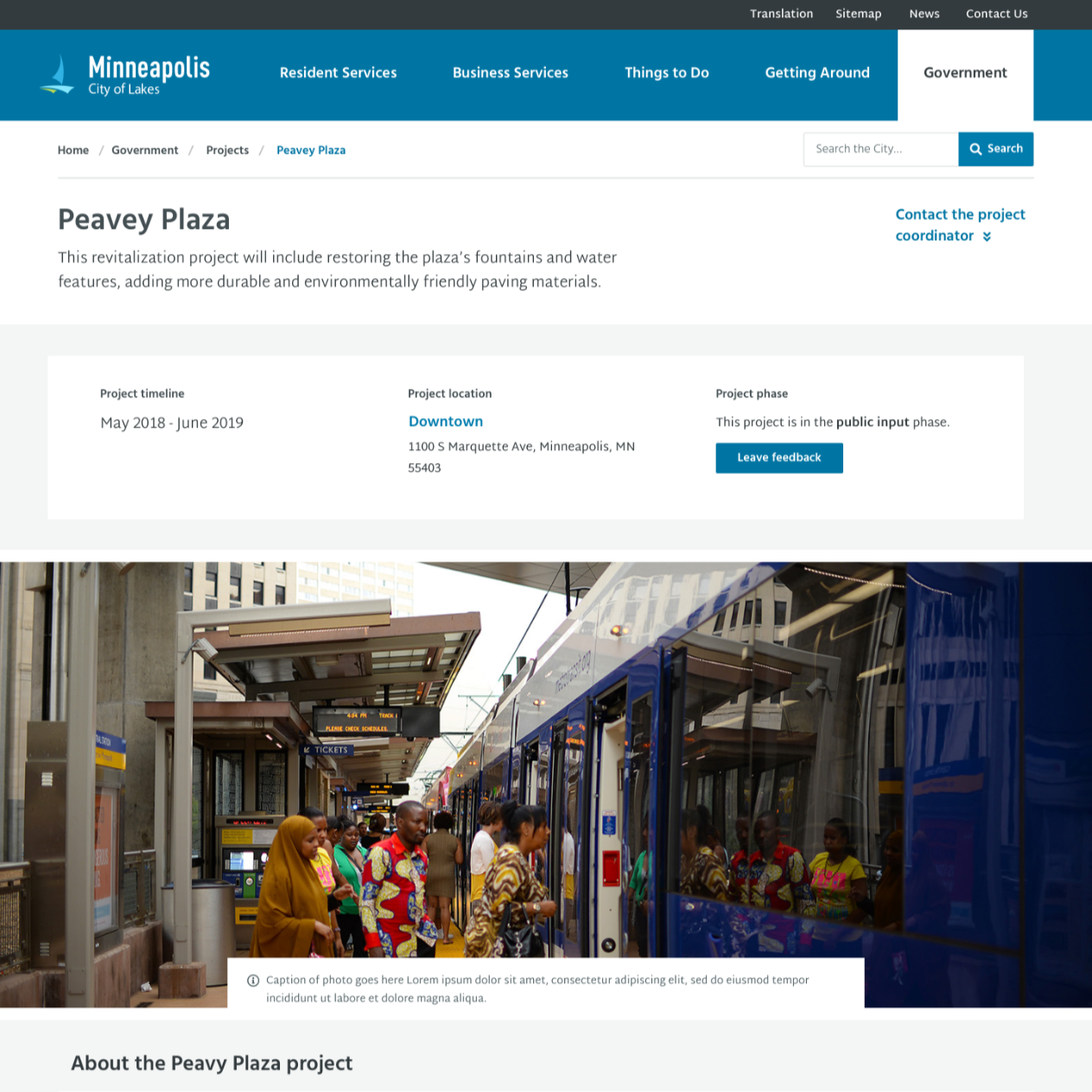
Project
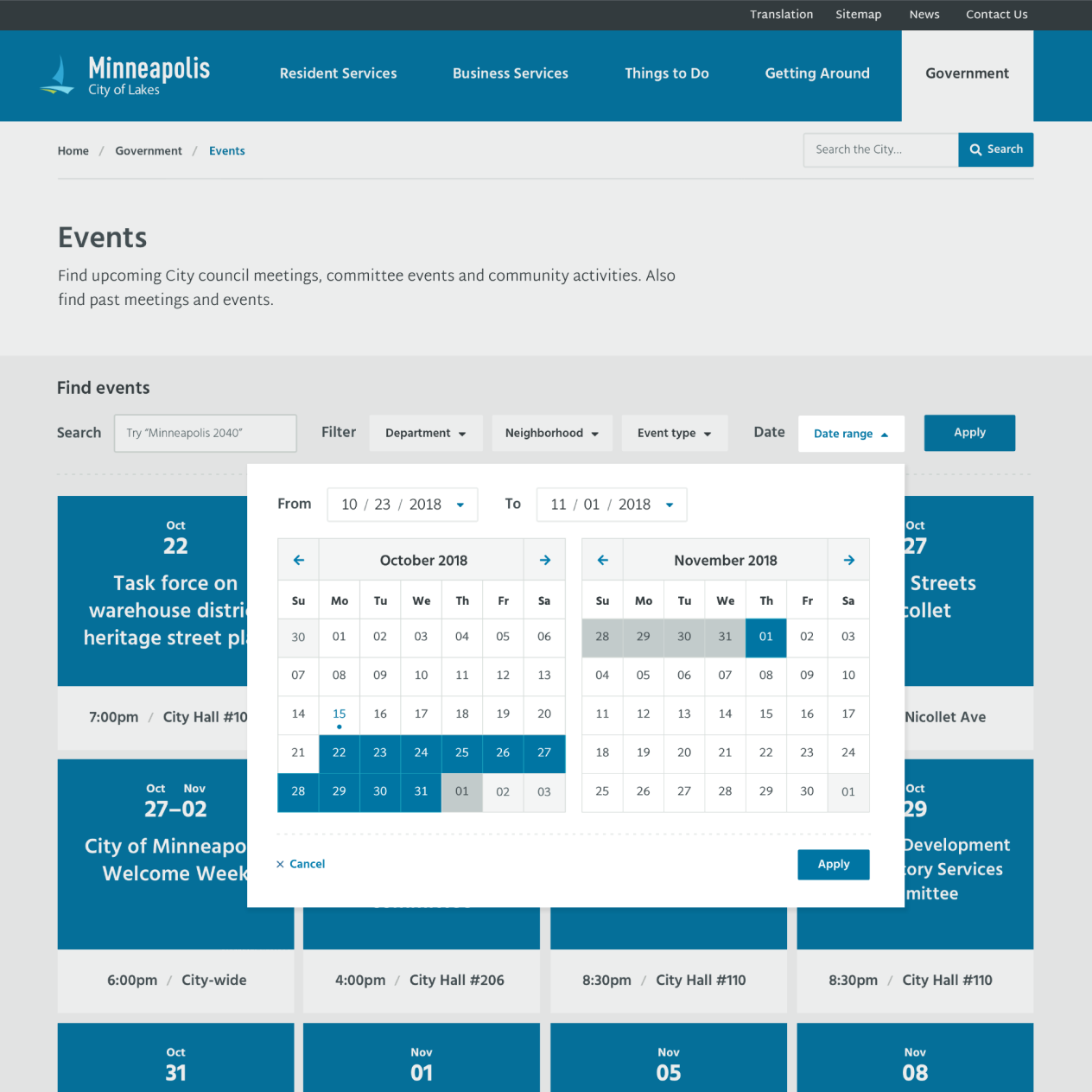
Events
Training content teams
Next, we lead several training to help content teams skill up. We paired this with robust governance and guides for the City’s content teams to help them learn the new system and make better content for the web.
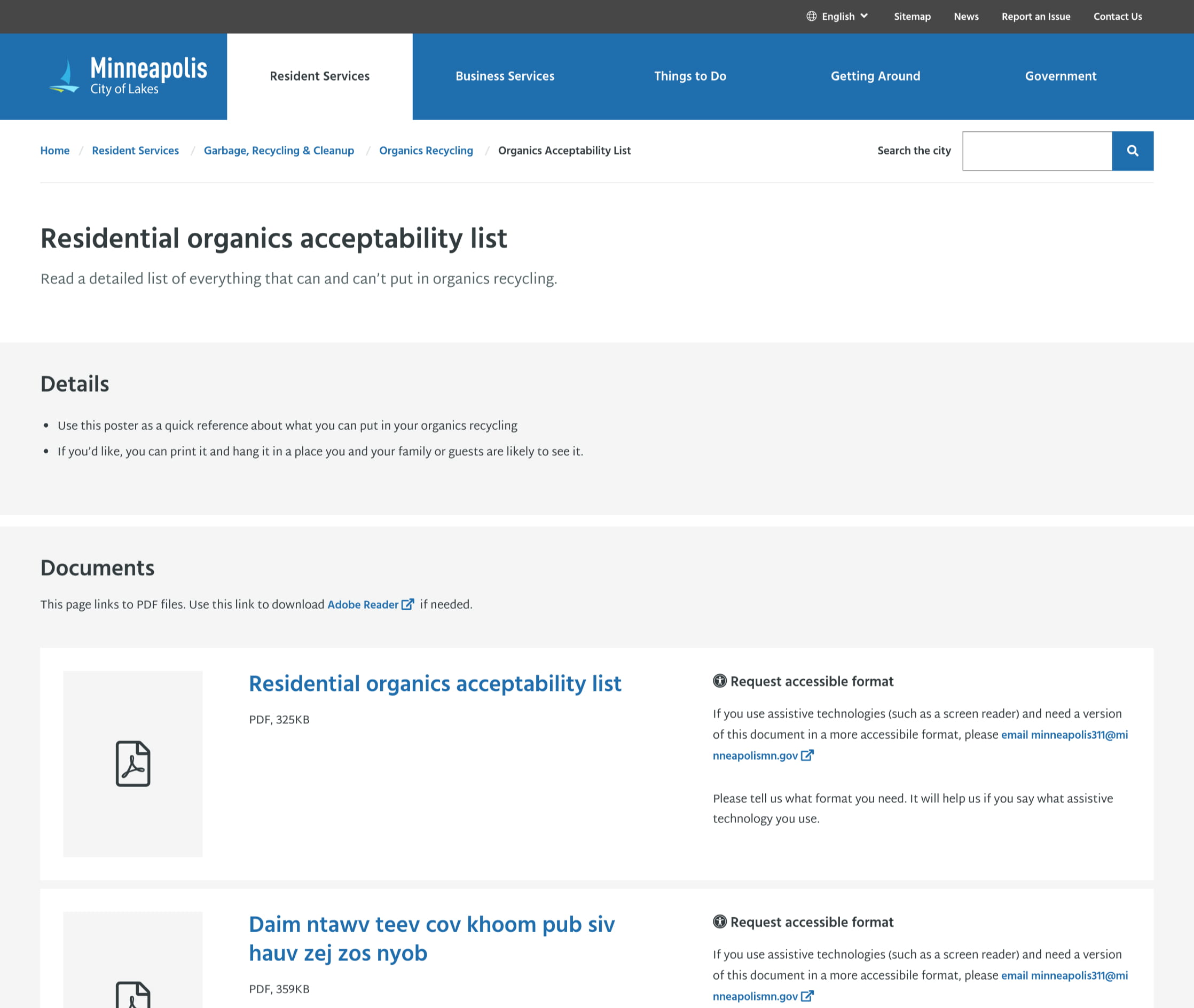
Handling necessary PDFs with accessible gateway pages
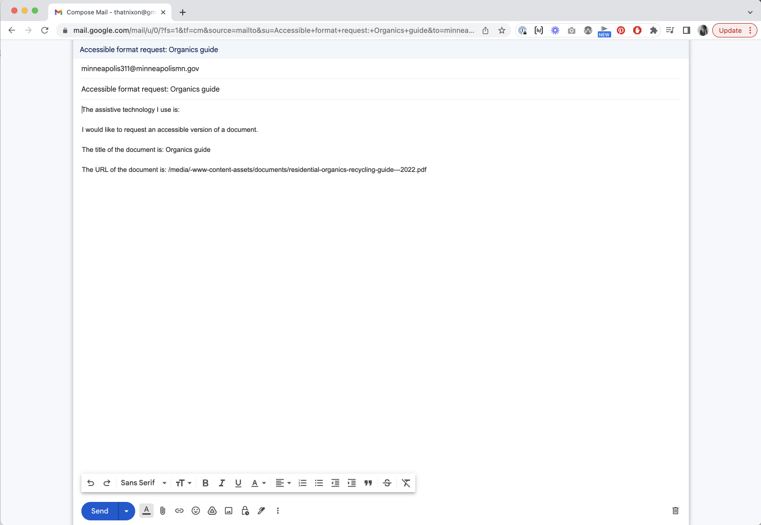
Even an “accessible” PDF is still a poor experience for screen reader users. Unfortunately the City had thousands of PDFs that couldn’t be removed without a massive internal process overhaul at the City. We consulted with screen reader users and worked with WeCo, a local accessibility consulting group, to come up with a new industry leading PDF experience – Gateway pages.
Now when a user clicks a link to a PDF, they’re taken to a document landing page first that announces the presence of the document and provides an overview of what’s inside.
Benefits of gateway pages:
- No more surprise PDF links that take users out of the browsing experience
- Easily request accessible accommodations
- Instant prioritization of what PDFs to remediate for content teams
- Easy way to house multiple versions of the same document – such as different language variations
Gateway page
Email with document link to 311
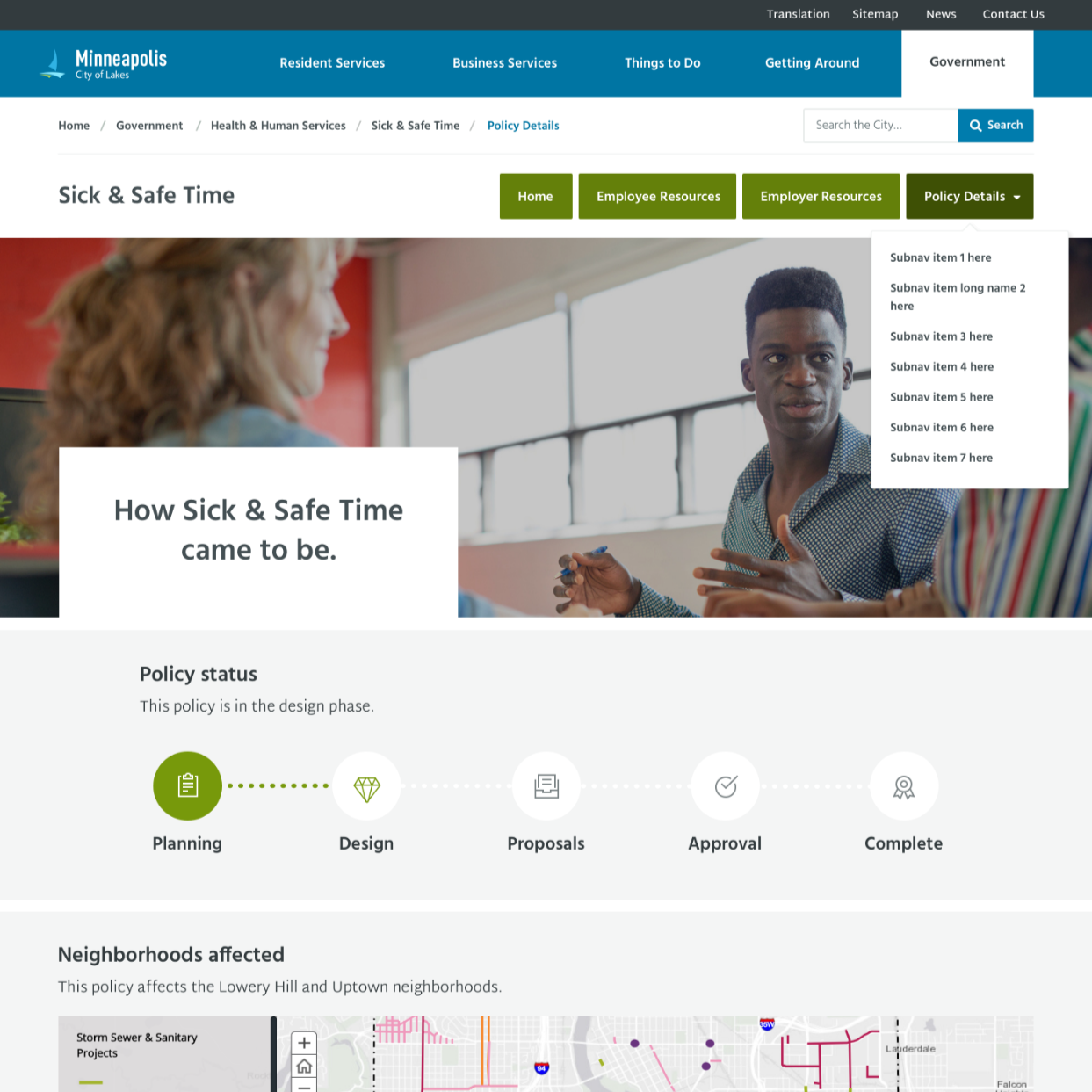
05 Design System
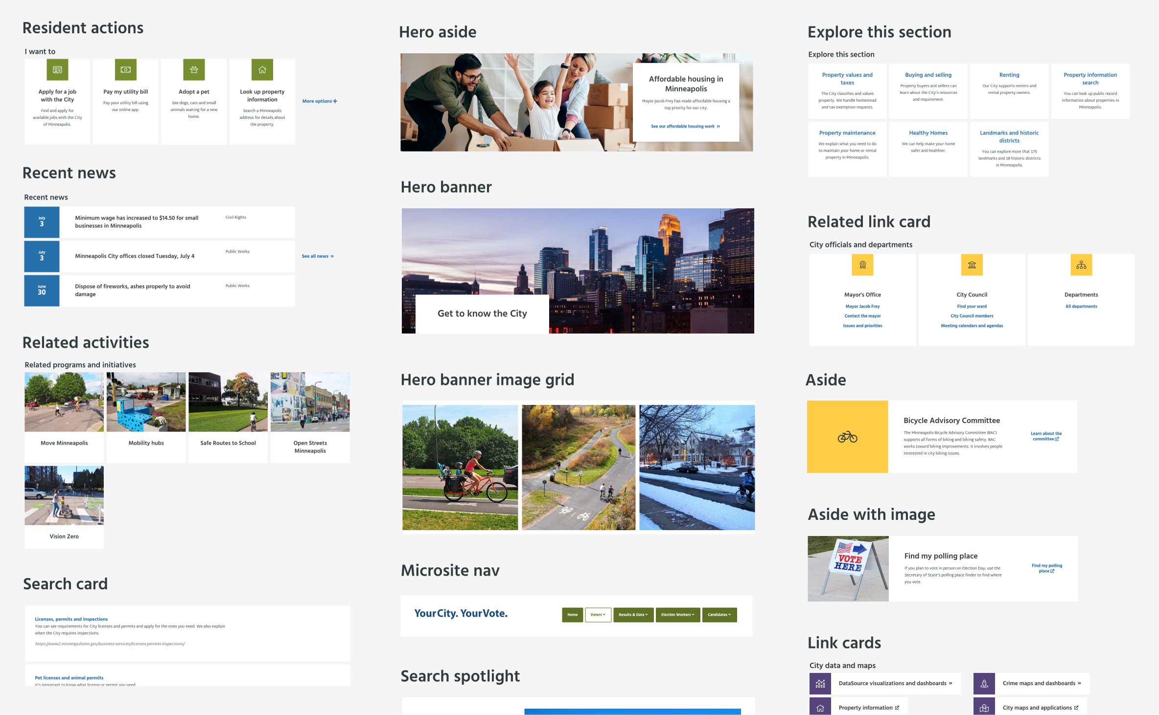
Cards
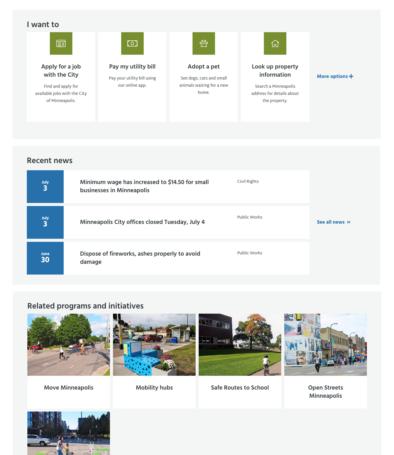
Banners
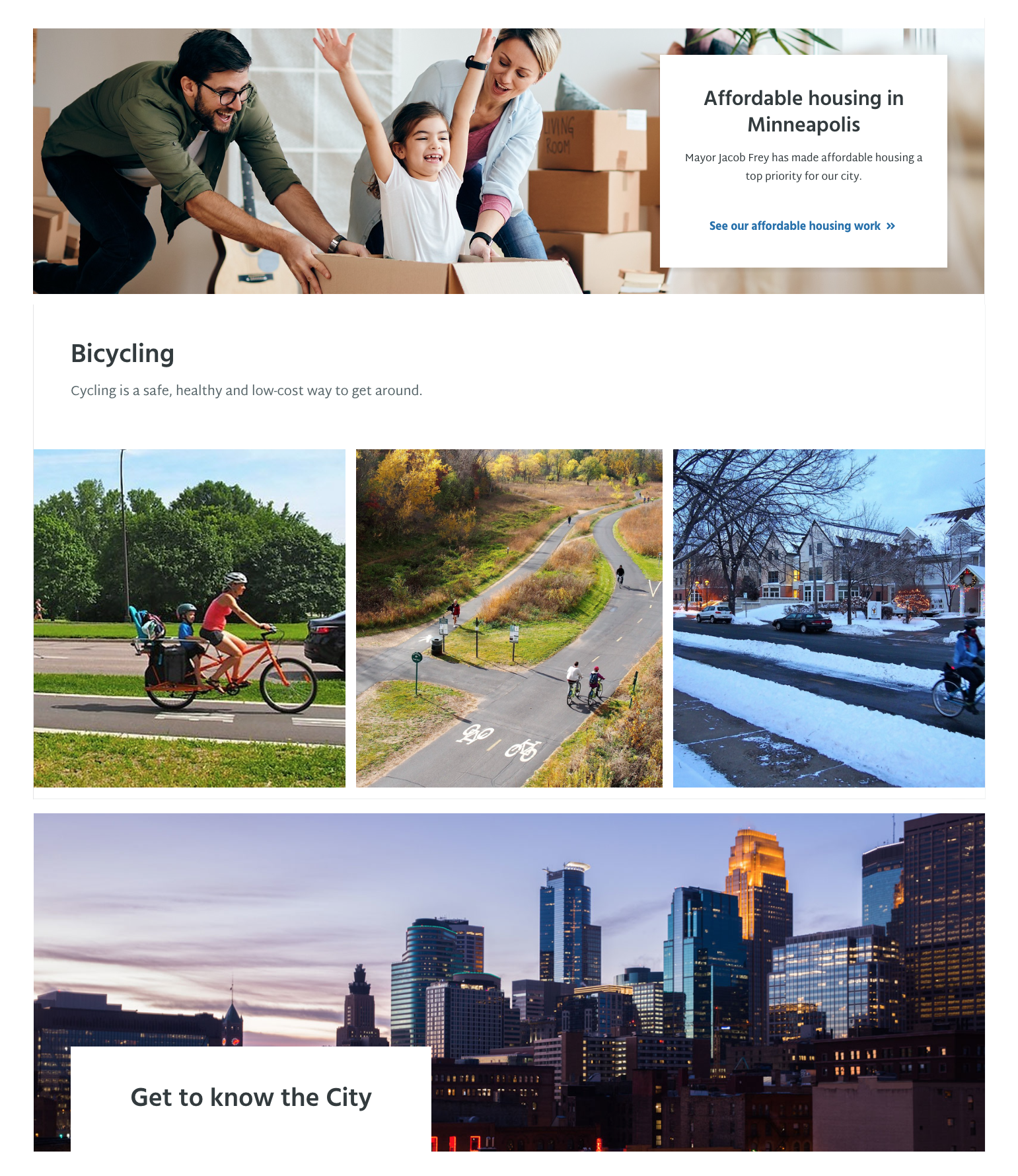
Links
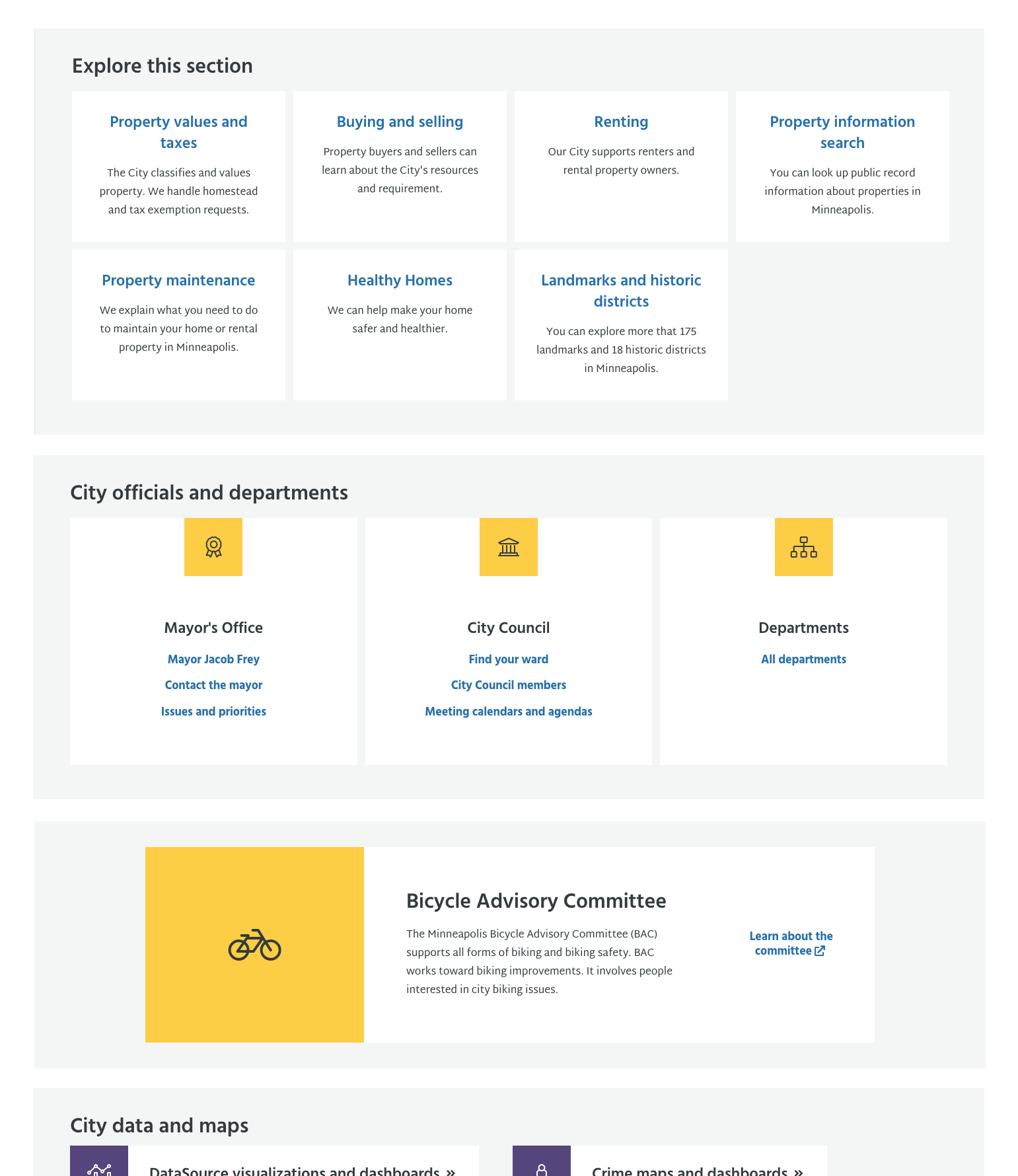
Search
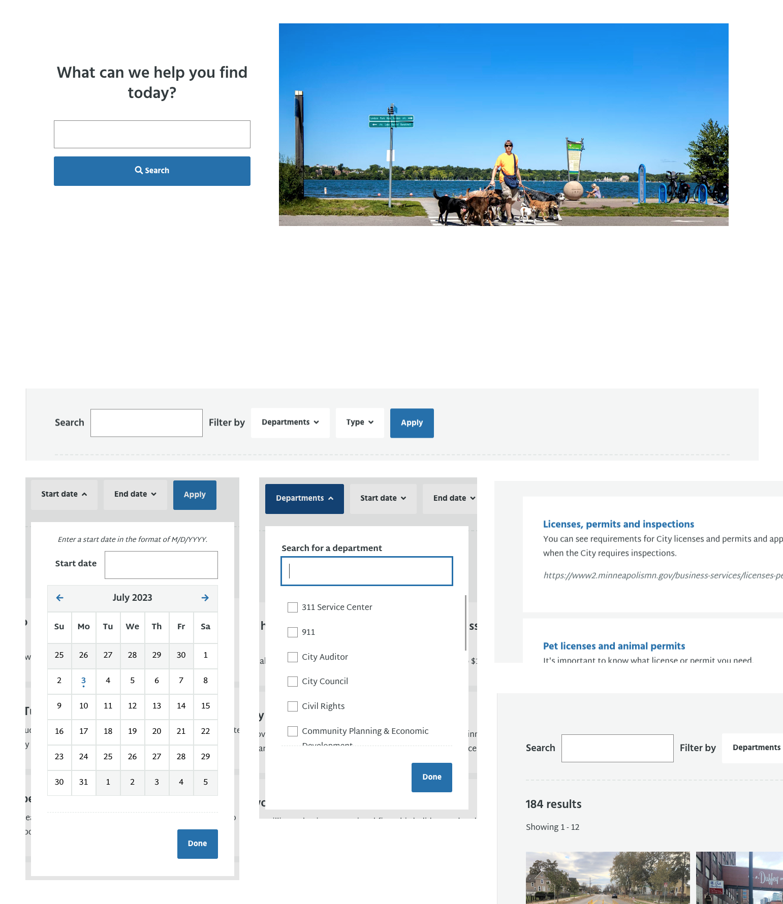
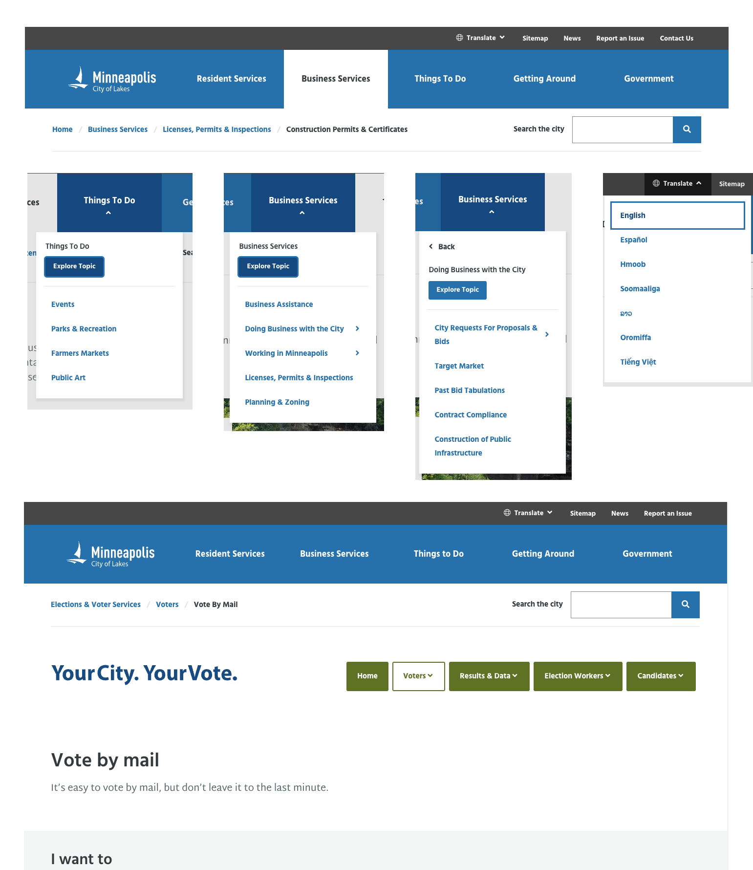
Navigation
Key principles
The City needed a new design system that could do it all.
Solid structure and guard rails would be critical so that content admins without design or UX skills could create beautiful, fool-proof pages with proper page headings. But flexibility was also important – how could we keep rogue admins away from the temptation and flexibility of micro sites?
Lastly, the system needed to do all the heavy visual lifting – great photography and iconography had always been a struggle at the City.
So I started work on a design system with these 3 key principles:
Foolproof flexible

Beautifully simple

Accessible by design

An in-depth component library
I created a fully responsive component library with over 40 different components. Each component is designed to fit within a single row on a page, allowing them to be completely modular.
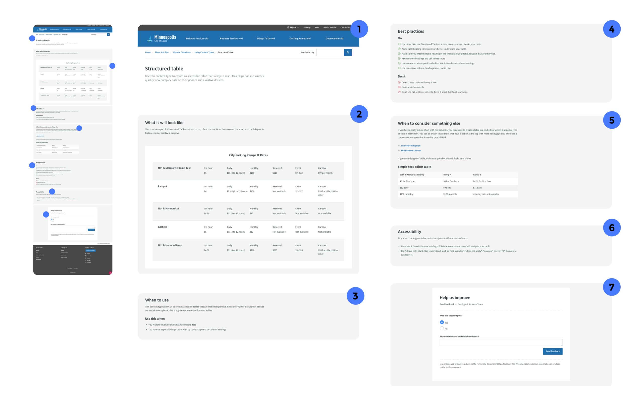
Detailed documentation
Each component has its own dedicated how-to page that covers:
- what the component is called and a brief description of what it does
- a live, responsive demo of what it looks like
- common do’s and don’ts
- alternative component options and why you’d use them
- accessibility considerations
Most importantly, we provided an easy way for content teams to provide feedback on the component and our guidance so we can prioritize what’s causing blockers for content teams and continue to iterate.
Dedicated how-to pages for each component